Objective: Create a cohesive visual identity that reflects minimalism as well as delicacy & feminity.
Services: Visual Identity Design, Logo design, Social media content production, Web design
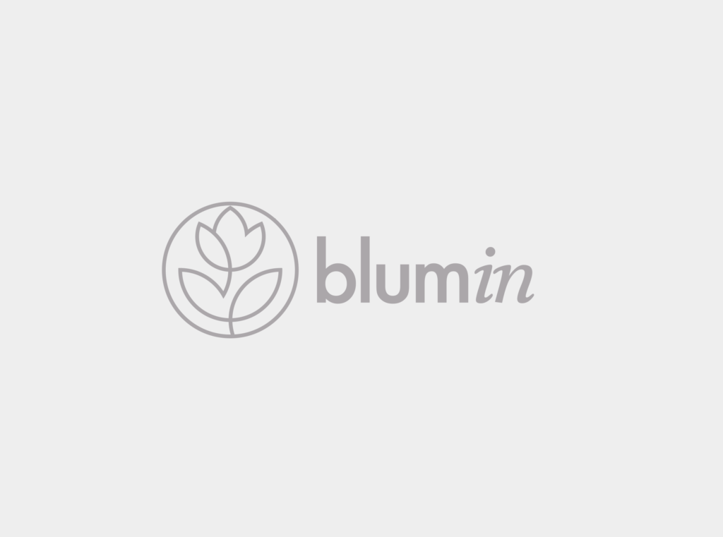
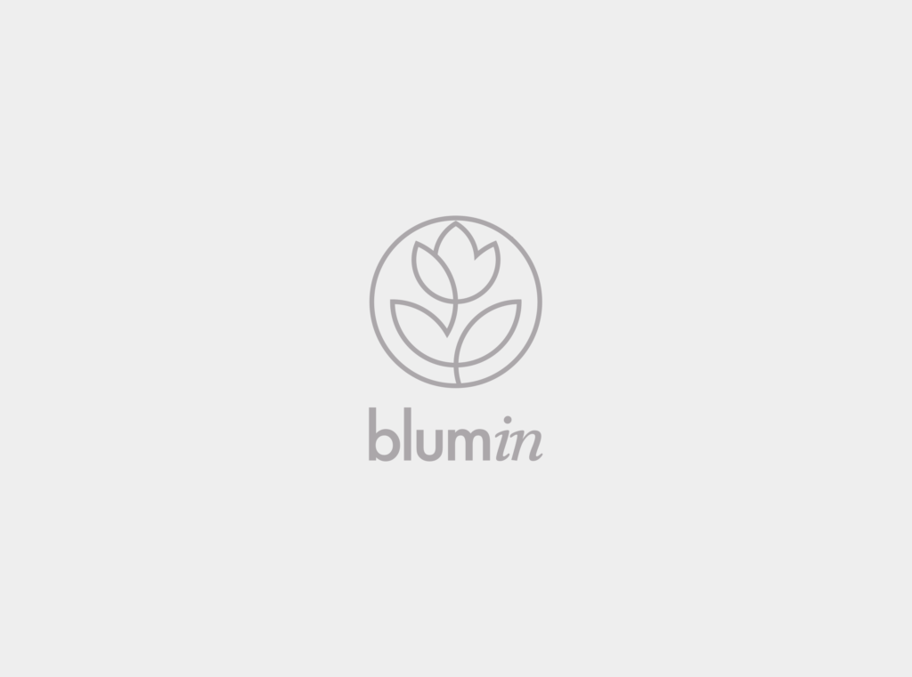
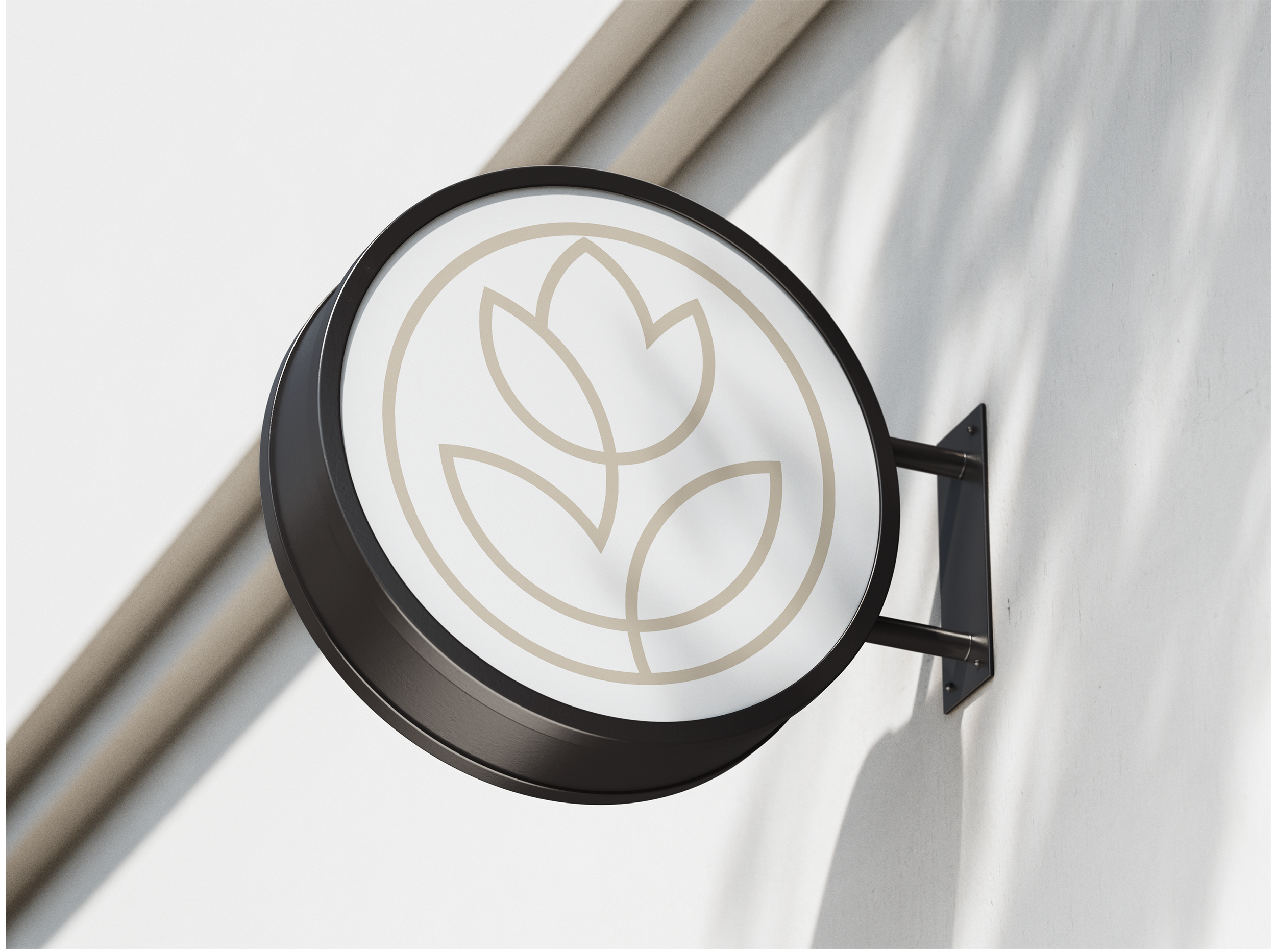
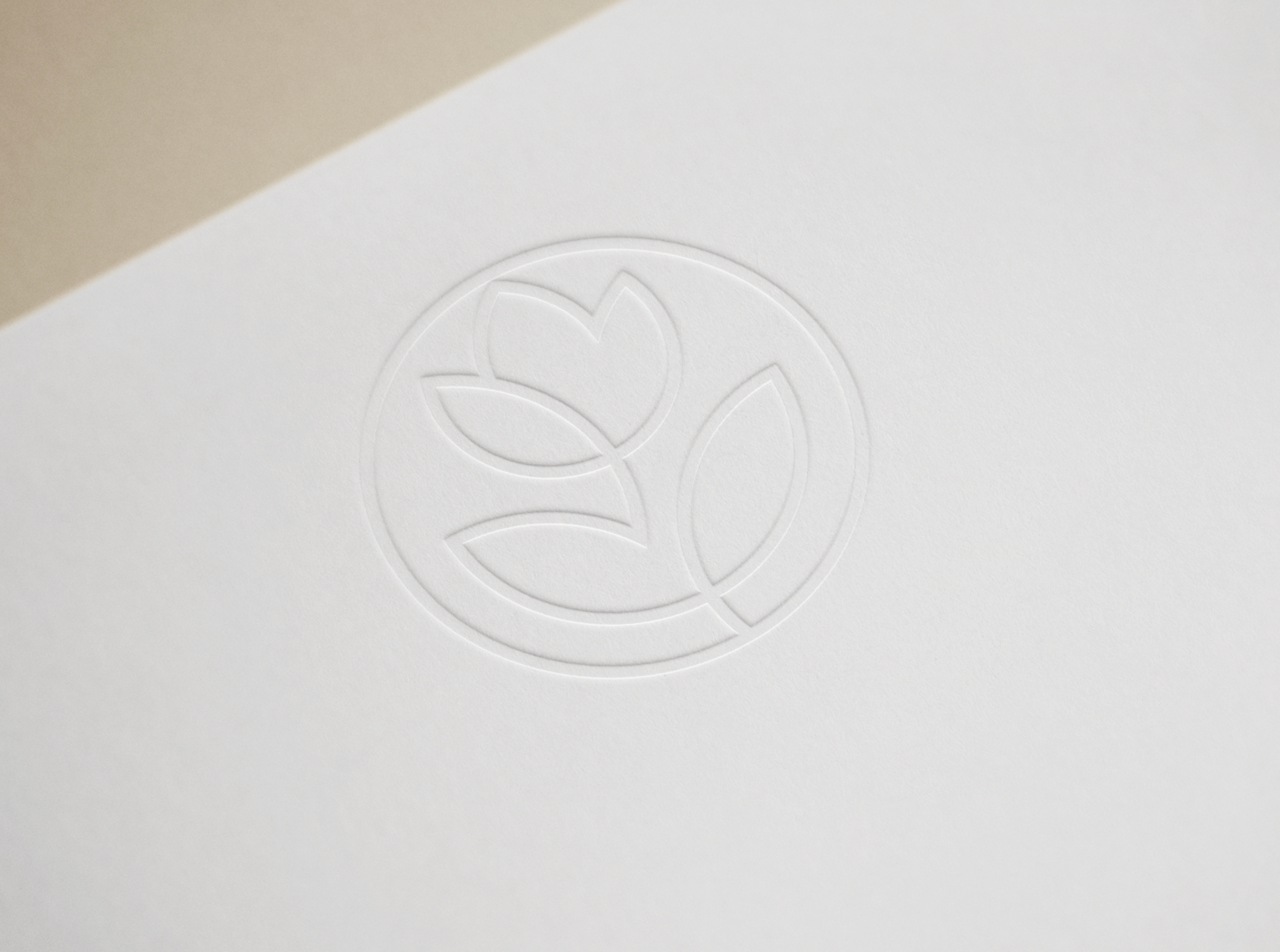
Logo design
The Blumin logo blends a minimalist flower icon with a clean, modern sans-serif font. The flower symbolizes natural beauty and growth, while the soft curves reflect the brand’s gentle yet sophisticated approach to skincare. The design plays with symmetry and simplicity, which appeals to Blumin’s target audience—individuals who value elegance in minimalism.
Color pallette & typography
The palette combines understated sophistication with a modern, minimalist edge. The soft neutrals provide a clean and polished foundation, allowing the design to feel both fresh and timeless. The subtle contrast of cool tones establishes a sense of calm and professionalism, while the warm accent adds just the right touch of approachable elegance. Ideal for a brand that values both luxury and simplicity, this palette creates a cohesive and refined visual identity.
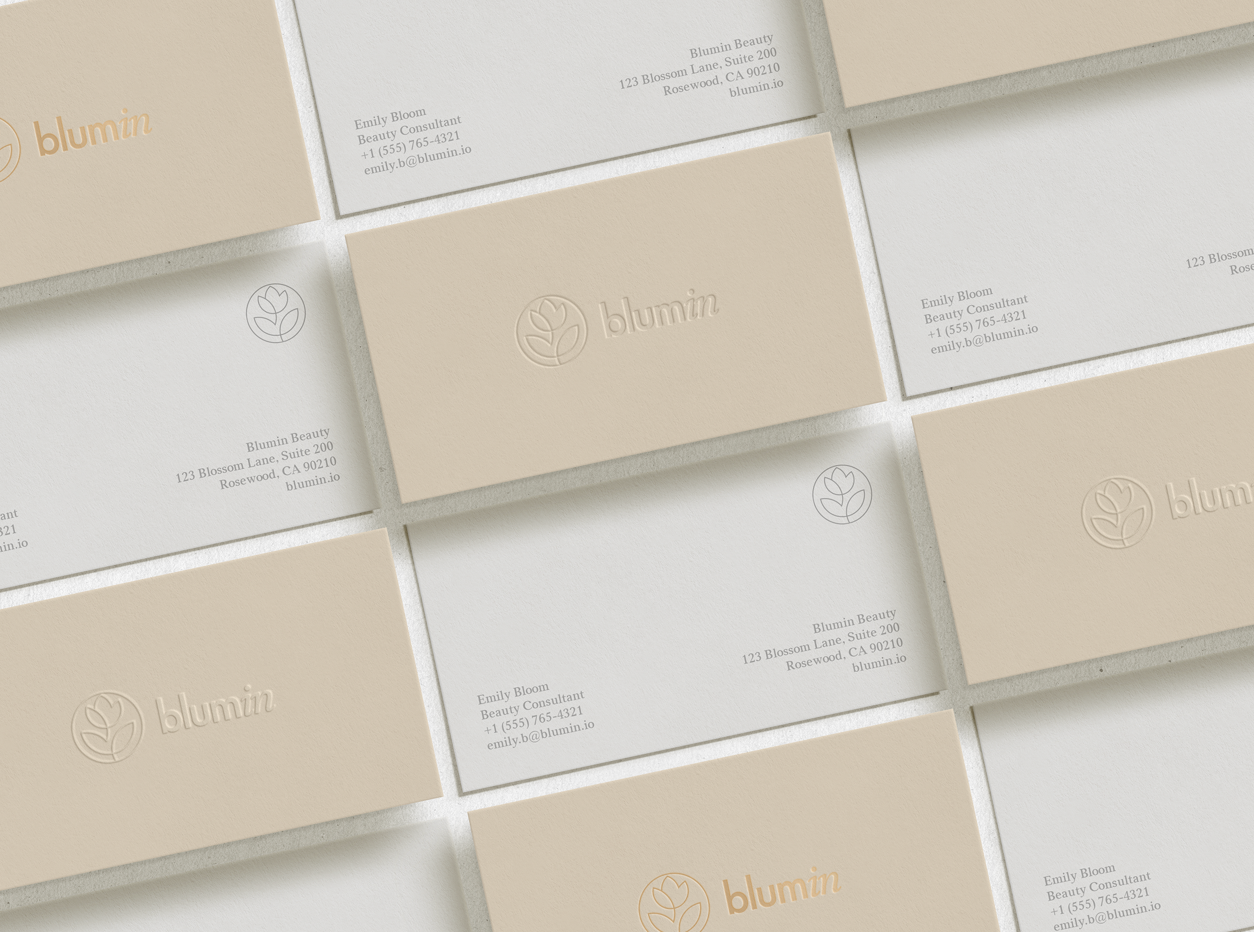
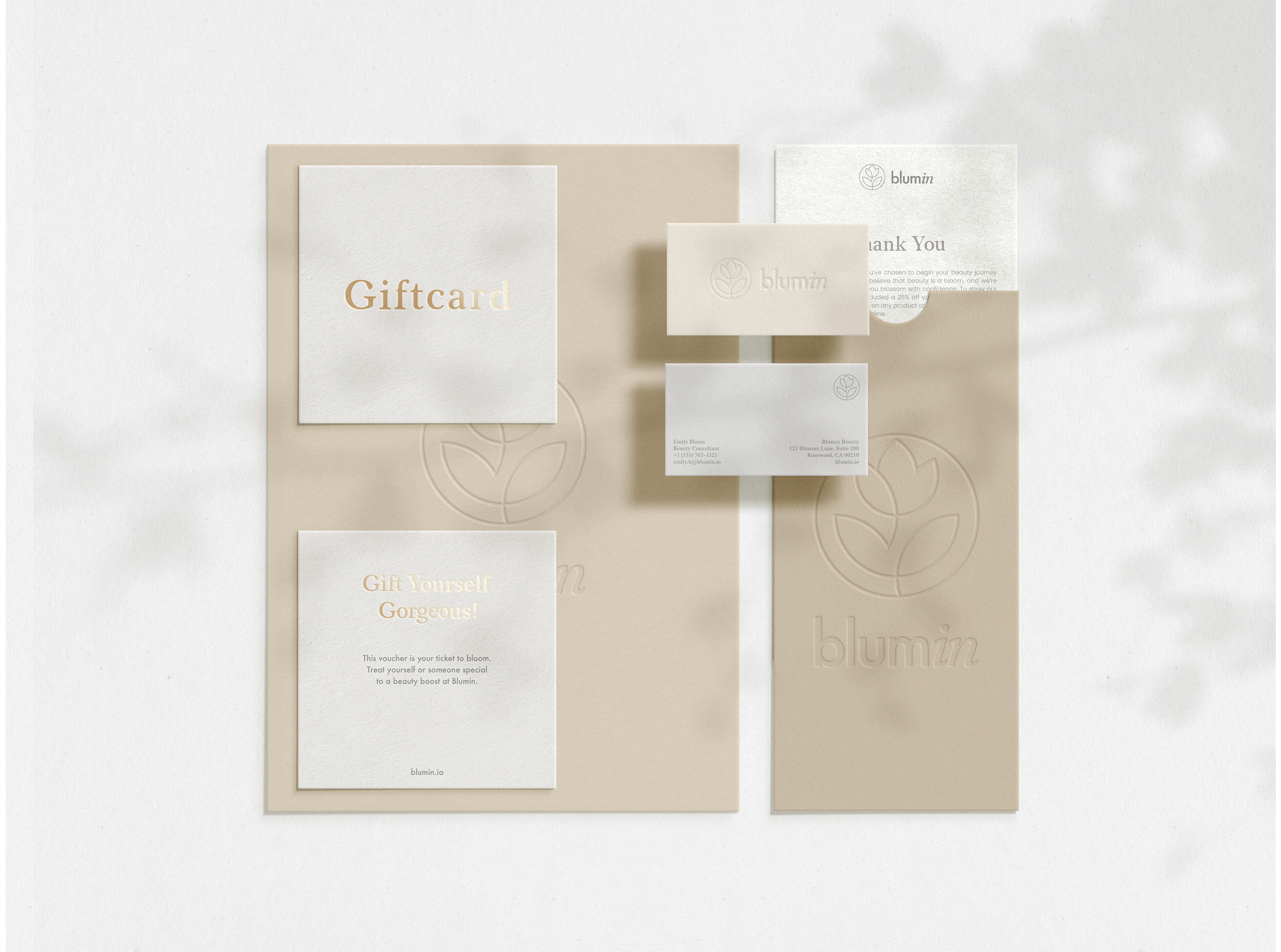
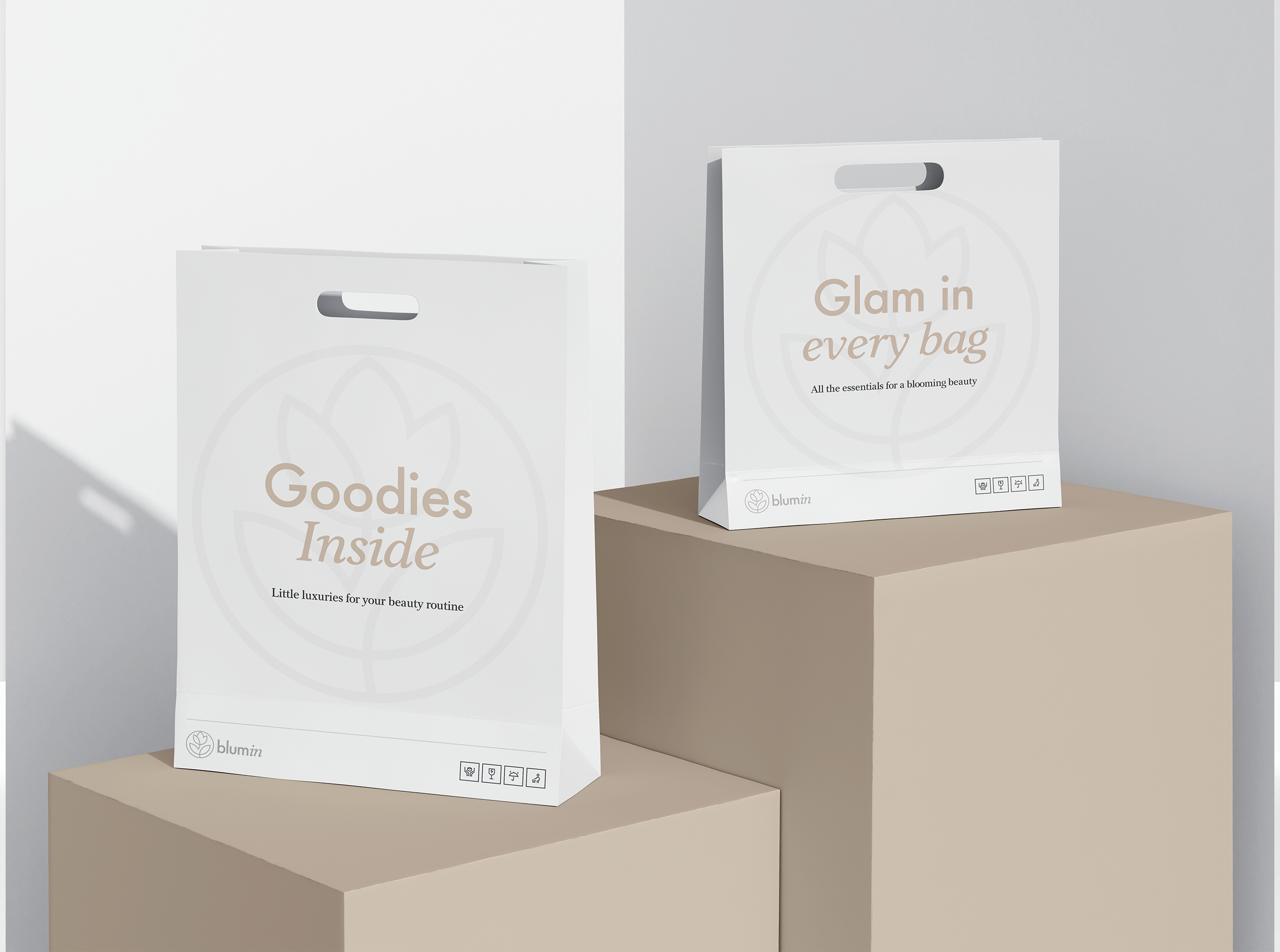
Stationary Branding
The stationery designs maintain the clean, minimal aesthetic, reinforcing brand consistency. Business cards feature the logo embossed with subtle texture, while the use of white space emphasizes clarity and professionalism. The packaging maintains the brand’s refined and natural color palette, ensuring the physical touchpoints reflect the same level of care and quality that Blumin promises in its products.
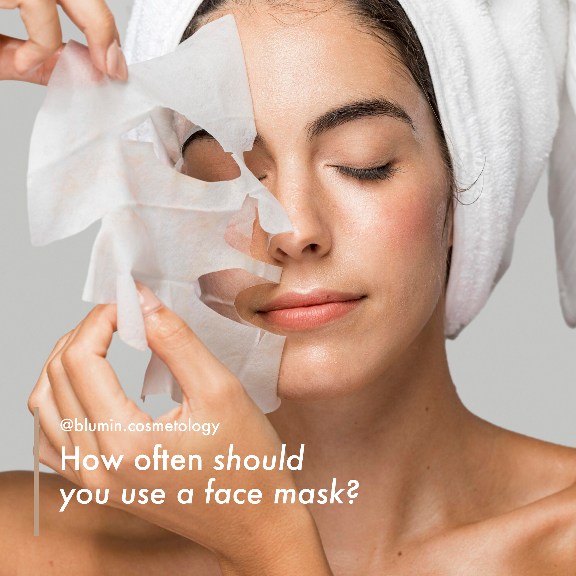
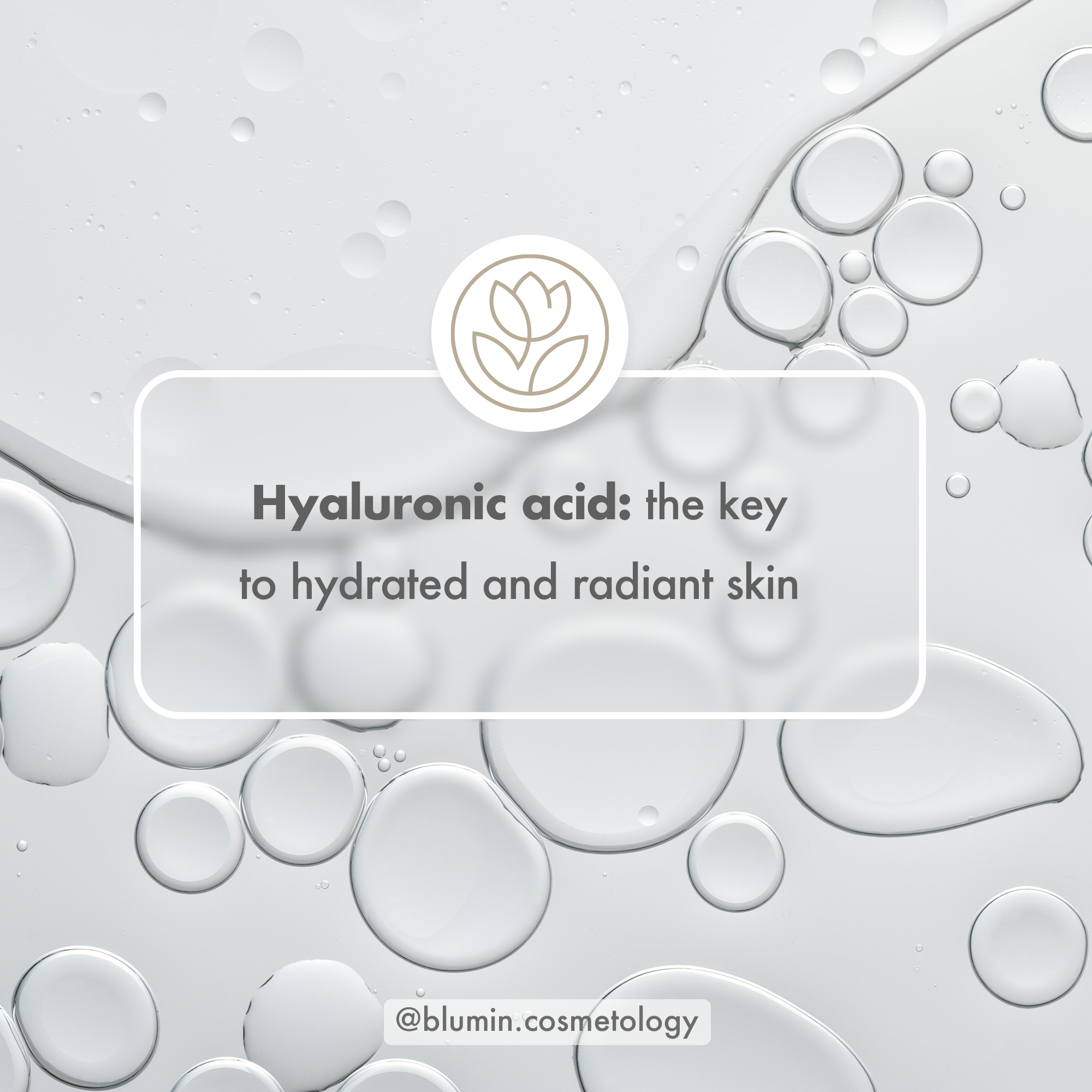
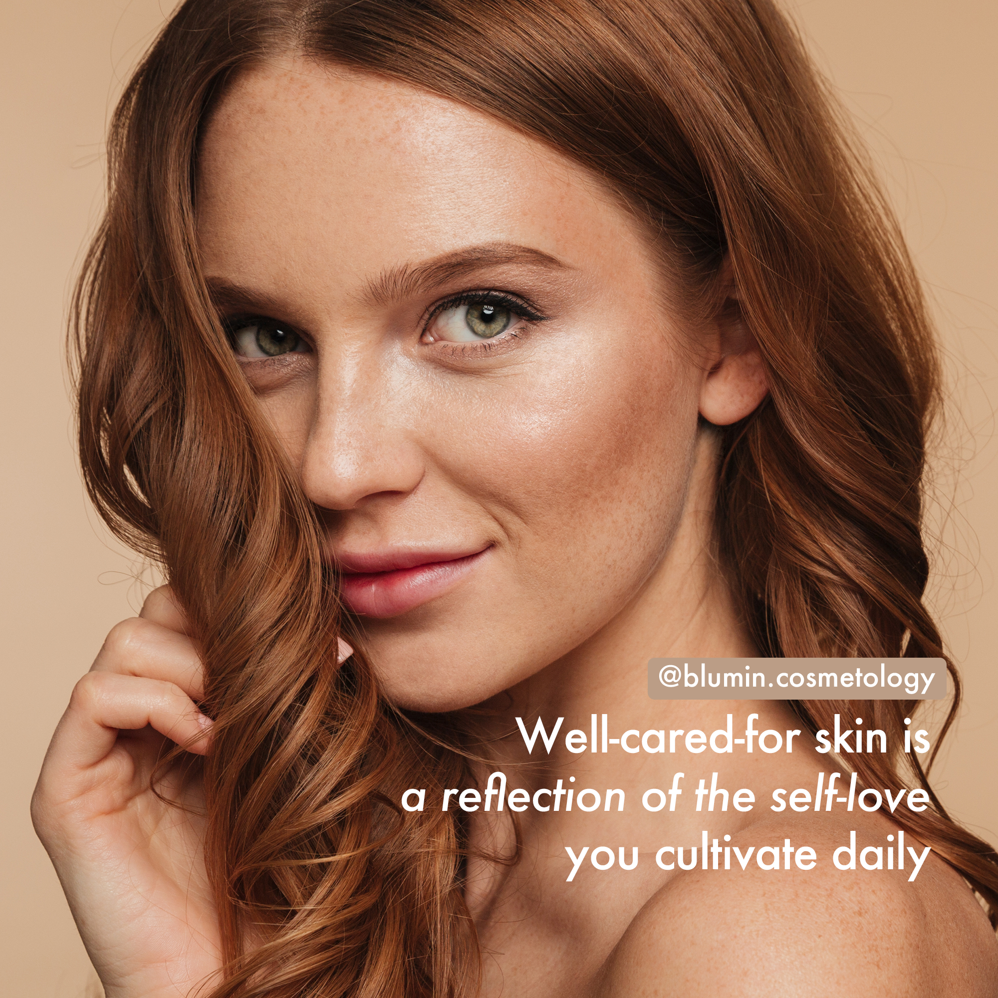
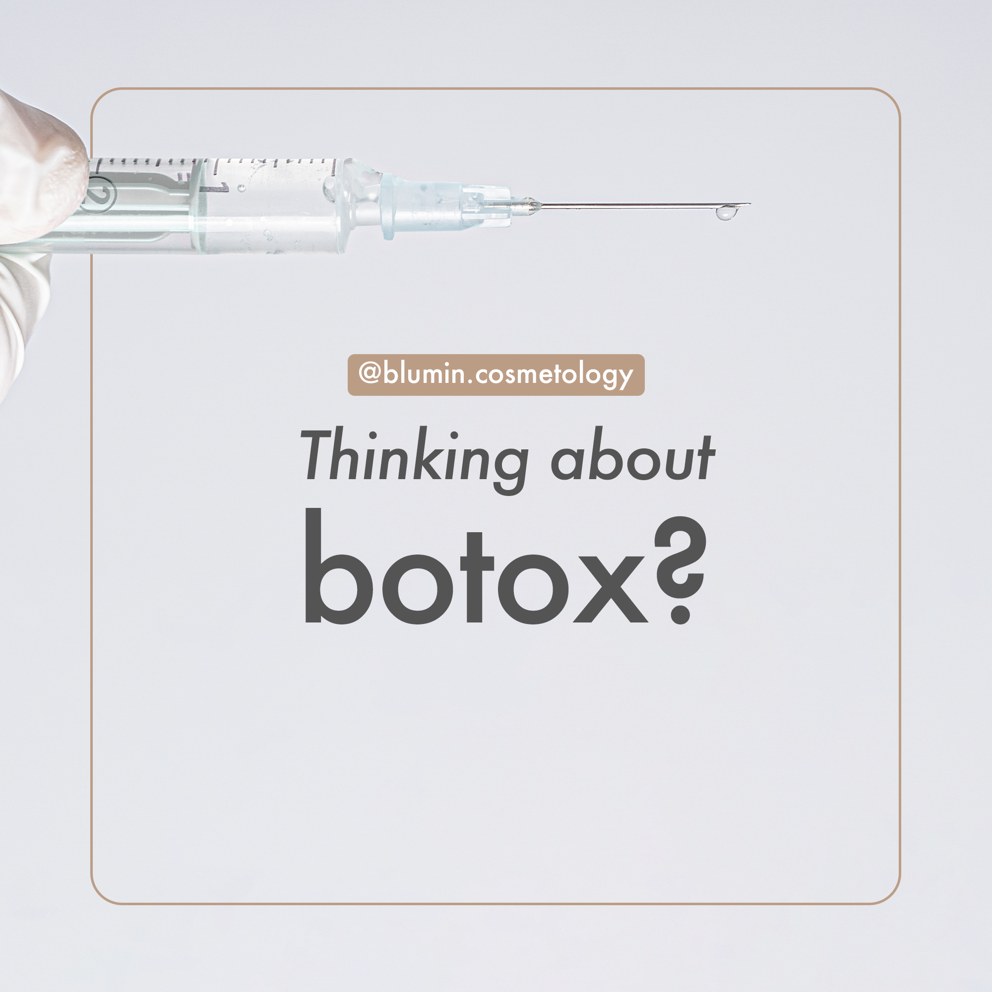
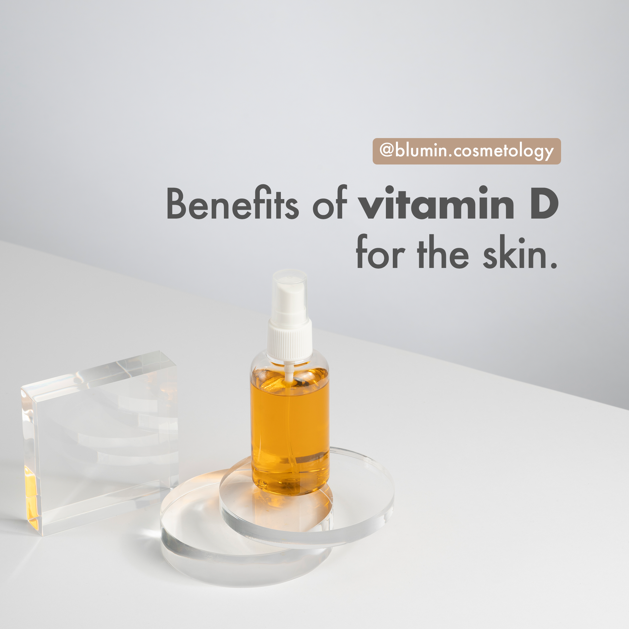
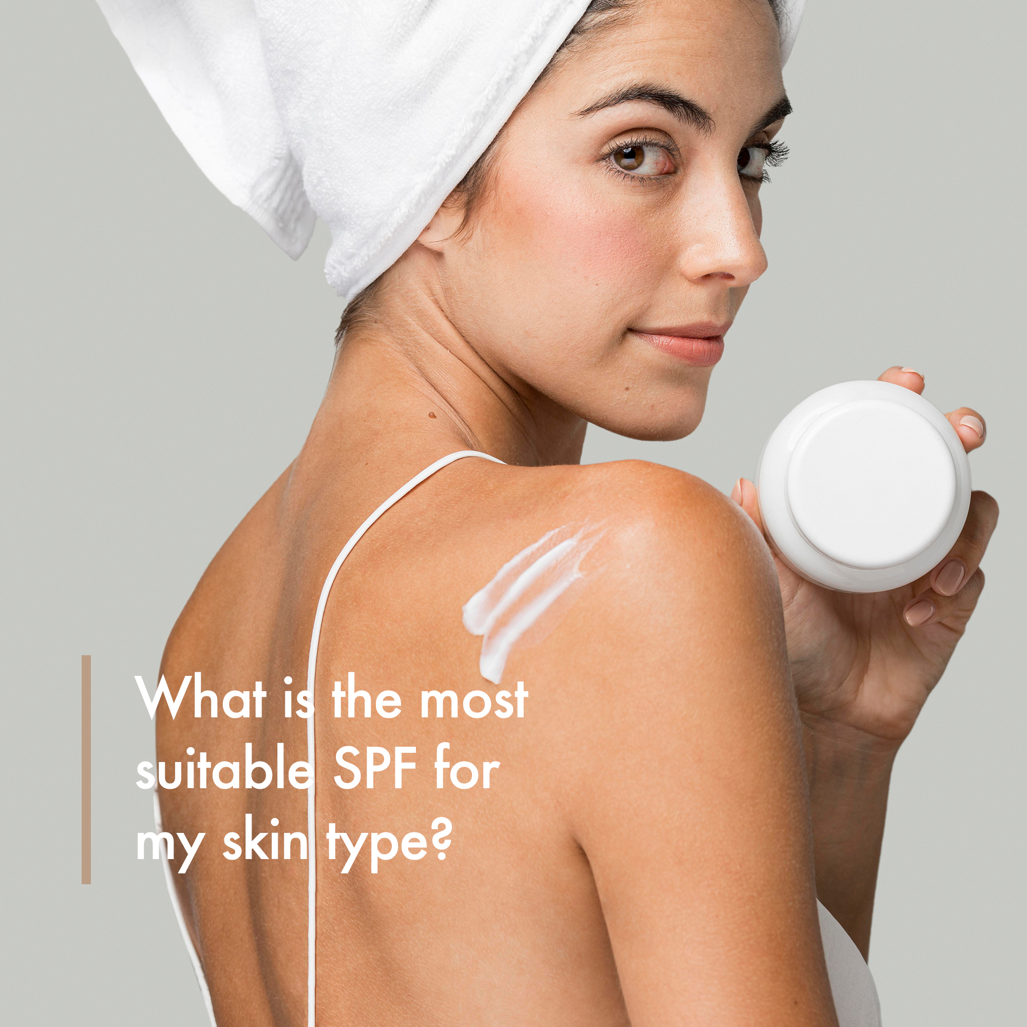
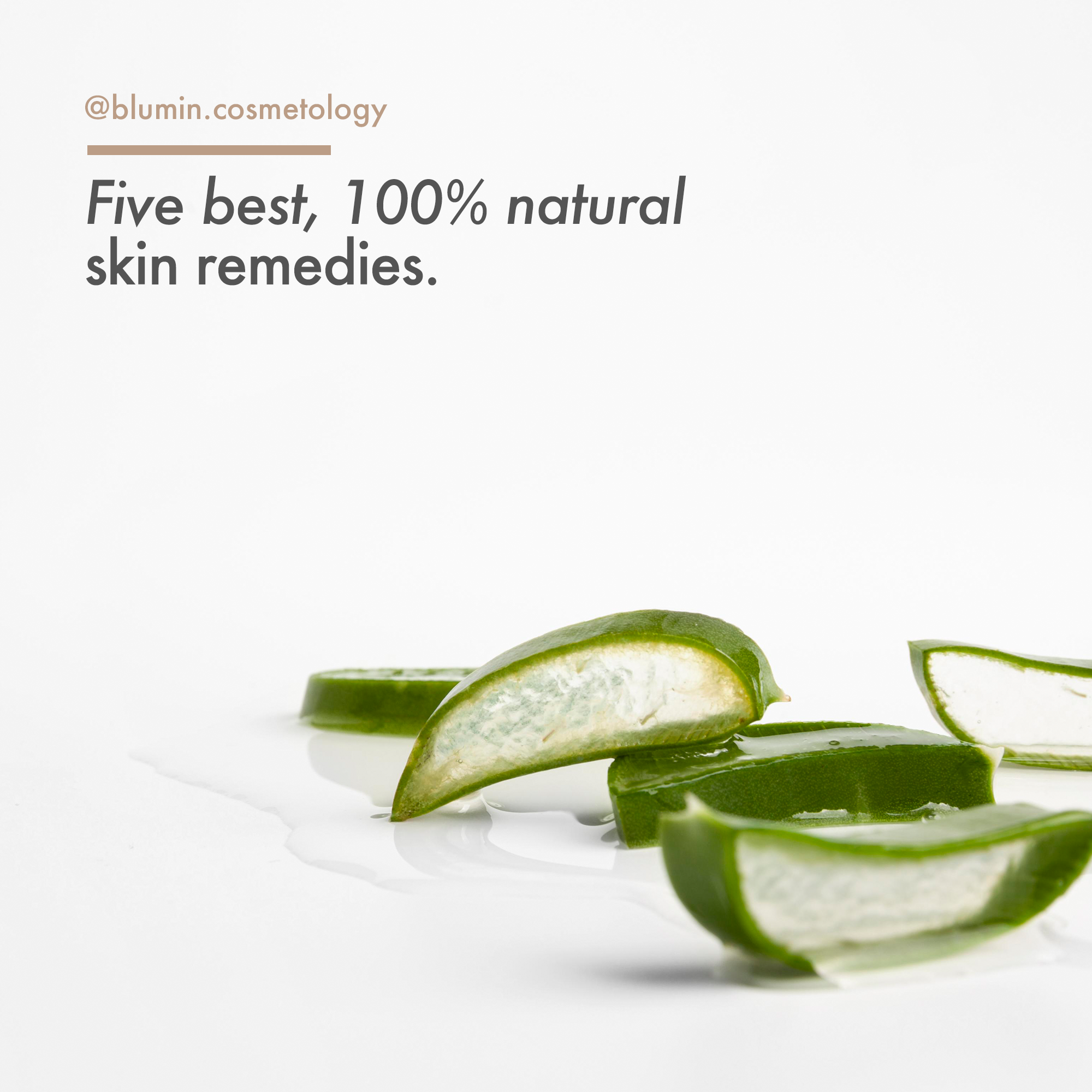
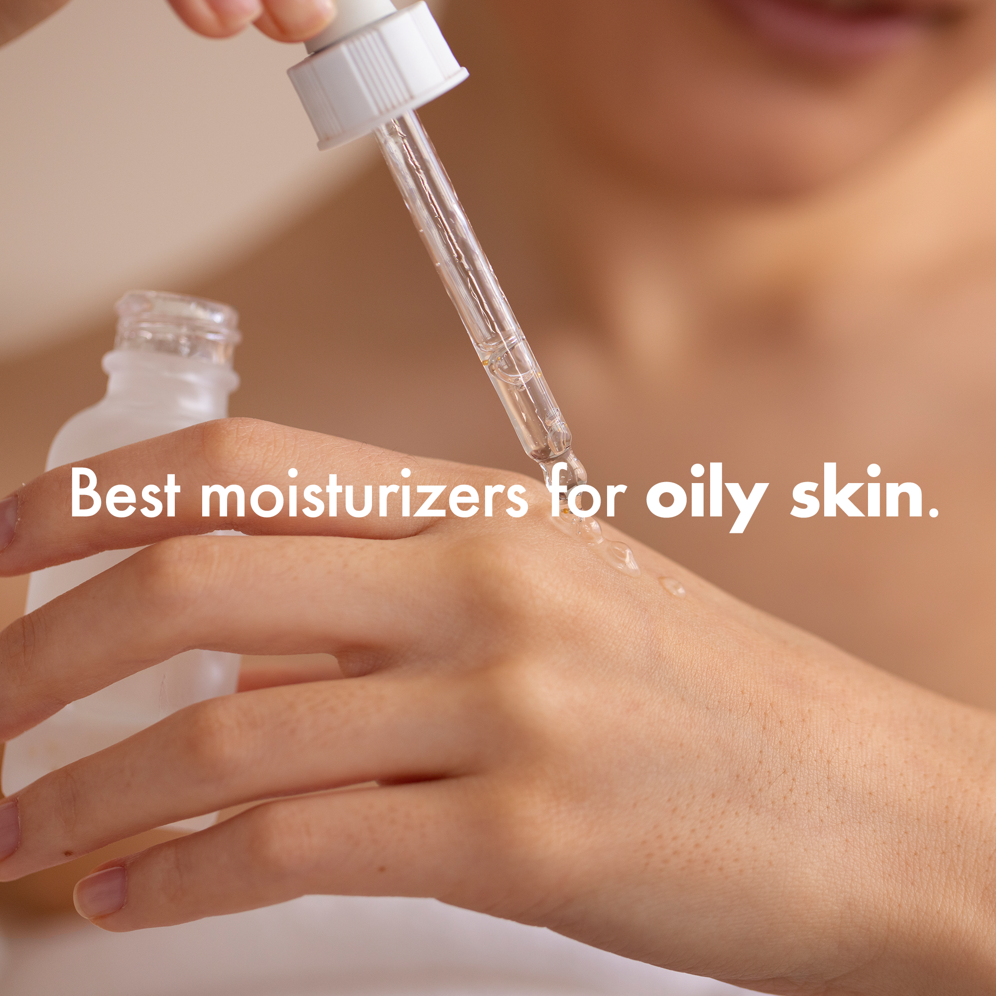
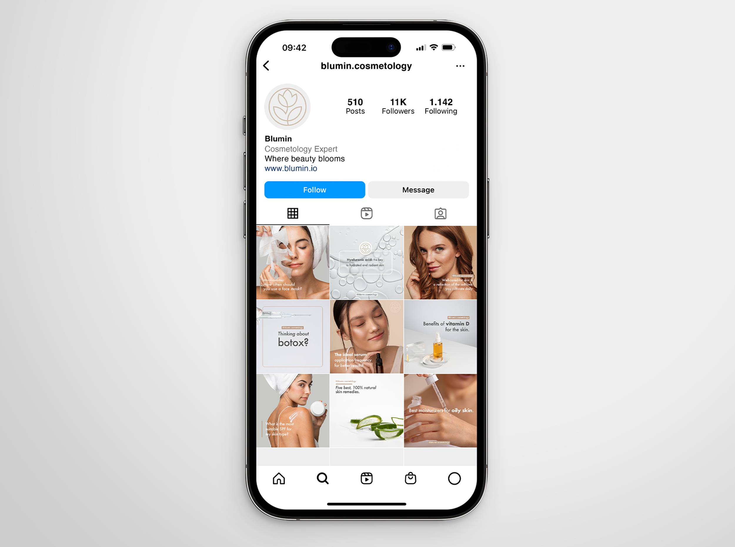
Social media content
Blumin’s social media strategy visually aligns with the brand’s identity, focusing on soft, serene imagery that highlights beauty, skincare routines, and product features. The posts are carefully curated to reflect the natural color scheme, using clean visuals and subtle text overlays. This approach fosters a cohesive online presence that enhances brand recognition and trust among its followers.